Element Detail Panel
SigmafineHub Visualizer widely uses panels that are activated from the command bar. The following provides some general rules describing how the SFHub Visualizer panels can be used and the related gestures.
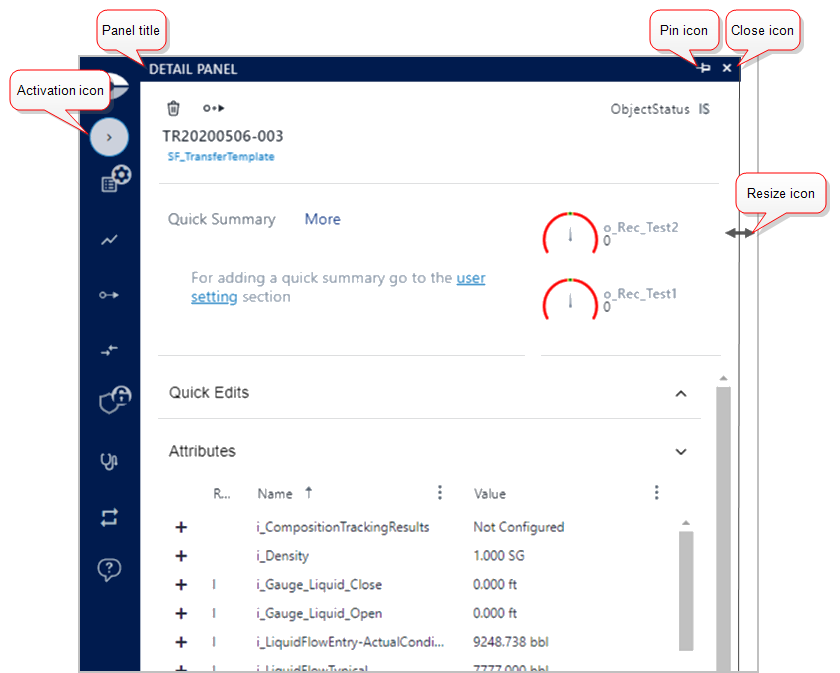
The Element Detail panel encloses all the information that you need to analyze the display elements, and includes all the required actions to change data in the Sigmafine Case.
| Icon | Description |
|---|---|
 | Activation icon: Collapses or expands the panel. When first clicked, the panel opens; when clicked a second time, the panel closes. Closing and reopening the panel triggers a refresh of the information. Once a panel is open, a click anywhere in the Display panel triggers it to close. |
 | Resize icon: Changes the width of the panel when you hover your mouse over the right border of the panel. |
  | Pin icon: Locks the panel open so that it does not collapse when you click elsewhere in the Display panel. - When the pin is horizontal, it indicates that the panel is locked and will not close when you click elsewhere in the Display panel. - When the pin is vertical, it indicates that the panel is unlocked and will close when you click elsewhere in the Display panel. |
 | Close icon: Closes the panel. |
The Element Detail panel is organized as following; the red boxes reported in the picture indicate that the symbol or the information is visible only in certain conditions.
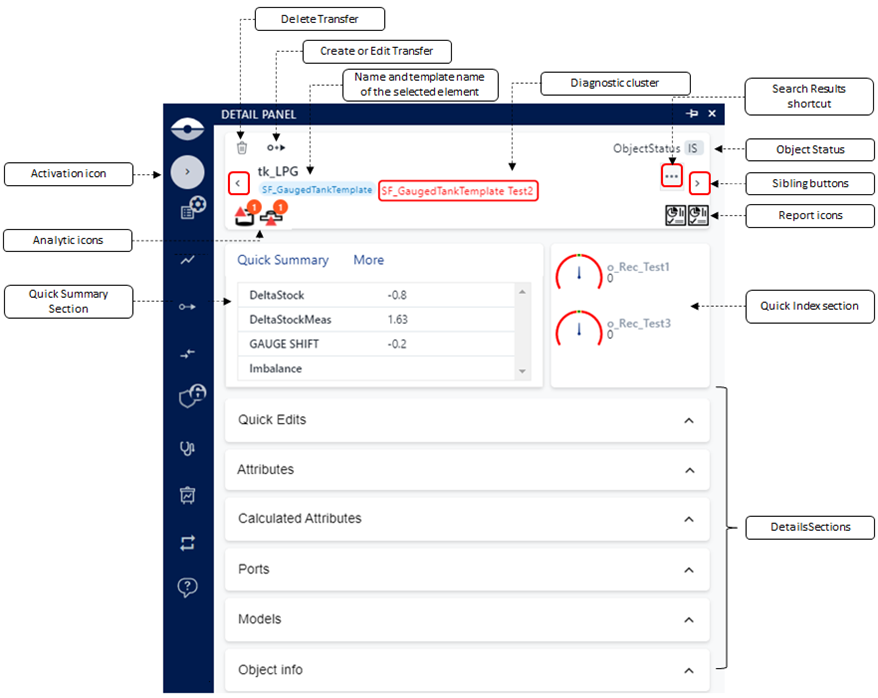
The panel is divided into three main sections:
General Information - The element's general information is listed in the first section at the top of the Element Detail panel, in a single sub-panel. This section includes information such as element name, template name and the element's service status.
Summary & Index - The second section, divided into two sub-panels, contain the quick summary of information about the element and a quick index of that elements test results. More information can be found in the Element Detail Panel Information Descriptions table.
Details - The third section, divided into several sub-panels, provides access to all the details about the element. More information can be found in the Element Detail Panel Information Descriptions table.
Element Detail Panel Information Descriptions
| Icon | Description |
|---|---|
Detail Panel activation icon | The Activation icon collapses and expands the element Detail Panel. The Element Detail panel is generally activated automatically when a symbol on the display is selected. The activation icon on the command bar could be used when needed in case the panel has been closed. This icon is hidden as soon as a display has been opened and it will be visible as soon as an element has been selected on the display. When first clicked, the panel opens; when clicked a second time, the panel closes. Closing and reopening the panel triggers a refresh of the information. Once a panel is open, a click anywhere in the Display panel triggers it to close. |
| General Information | |
 Delete Transfer | If a transfer is currently selected, the delete icon allows you to delete the transfer. |
 Create or Edit Transfer | If the current selected element is a node, tank, process unit or boundary element, it allows to create a transfer activating the create transfer panel. If the current selected element is a transfer, it allows to edit a transfer activating the edit transfer panel. |
  Sibling Buttons | Sibling buttons allow you to navigate through a collection of elements returned by the Search, or when you are looking at an element collection shown by the SFHub Visualizer Diagnostic. |
 Analytic icons | SFHub Studio Analytic icons may appear in this area as a result of a search over the SFHub Studio Analytic results. When hovering over the icon, the diagnostic message is shown. When you click the icon, the SFHub Studio results panel opens and the message details are shown. The icons displayed, depend on the severity assigned to the insights generated by the analytics. Refer to the "SFHub Studio User Guide" for more details. Refer to the SigmafineHub Studio Settings for more details. ::: |
 Reports icons | Report icon display in this area. The icons display the available Reports of type Element, according to the reports configured in the referenced display settings. Hover over the icon to display the report name. Click the icon to open the Report Panel that displays the report for the selected element. You can open multiple reports at the same time by selecting the icons available on the tooltip or element Detail Panel. The same report can be opened in the context of another element in the display for which you wish to view the data. Note: Element Reports opened from SFHub Visualizer don't allow or support you to switch to another Case. As soon as you change the Case selection from the Case Search, the Report Panel automatically closes. ::: |
 Search Results shortcut | The Search Results shortcut button is visible only when the sibling buttons display. This button allows you to open the collection of elements you are navigating through. This collection of element allows to jump on another element. |
| Diagnostic cluster | When you are navigating an element collection of a diagnostic index, this area displays the diagnostic index cluster that you had selected in the SFHub Diagnostic panel. For example, if you are navigating through the diagnostic index Test2 of the SF_GaugedTankTemplate, this area shows that information. |
| Summary & Index | |
| Quick Summary section - Quick Summary tab | The Quick summary content could be a chart (pie, gauge, line, or bar) or a list of calculated on the fly values: Quick Summary tab examples 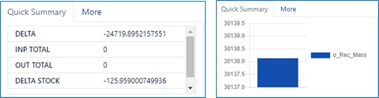 The Quick Summary section shows the information configured in the Quick summary section of the selected Sigmafine element template. Quick Summary Configuration Settings 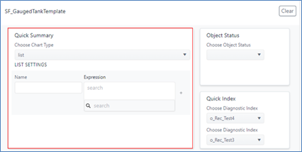 You can customize the Quick Summary section by submitting your needs to the SFHub administrator (if you are using a setting defined by the administrator), or changing your own SFHub Visualizer settings (if you are using your personal setting for the display). |
| Quick Summary section - More tab | The More tab displays some characteristics of the selected element. Quick Summary - More tab example 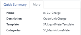 |
| Quick Index section | The Quick Index section displays the Quick Index values. Quick Index example  > >The Quick Index values are defined in the Quick Index configuration section of the Sigmafine element template. Quick Index Configuration Settings 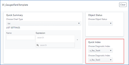 You can customize the Quick Index section by submitting your needs to the SFHub administrator (if you are using a setting defined by the administrator), or by changing your own SFHub Visualizer settings (if you are using your personal settings for the display). |
| Details | |
| Quick Edit | The Quick Edit sub-panel shows a limited list of attributes that were defined in configuration settings of the element template you are using. The Quick Edit attributes are the same ones listed in the tool tip panel. The Quick Edit allow you to have a restricted list of attributes in which you typically need to make changes. You can also create or delete adjustments from the Quick Edit panel. |
| Attributes | The Attributes sub-panel shows the complete list of attributes for the selected element. For each attribute, you can see the attribute name, value, UOM and additional columns that you can make visible. you can also create or delete adjustments from the Attributes panel. |
| Calculated Attributes | The Calculated Attributes sub-panel shows the calculation chain of the attributes having a data reference configured on them. |
| Ports | The Ports sub-panel shows the connection ports of the selected element. |
| Model | The Model sub-panel shows a list of the Sigmafine models where the selected element is referenced and used. |
| Object Info | The Object Info sub-panel shows the ADA Object Info panel where the detailed balance data are reported. This information is only visible for ADA |