Symbol Property Panel
The Symbol Property panel is activated when selecting a graphical entity on a display. The graphical entity may be:
- Graphic Symbol
- Graphic Template
- Connector
According to the selected graphic object, the Symbol Property panel allows to view and modify relevant properties. The property panel consists of the following tabs:
Style Tab
The Style tab of the symbol property panel is available either selecting a graphic symbol, a prefab symbol, a polyline or a text annotation. The style tab shows different options according to the selected type of symbol.
Symbol Style Tab
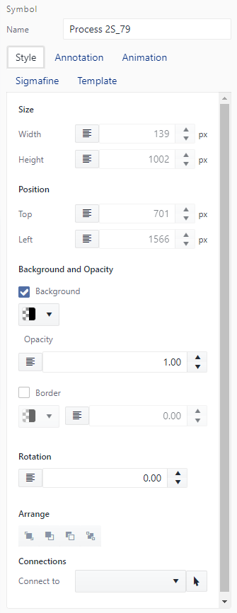
Size
Change the Height and Width of the symbol.
Position
Change the position of the symbol by modifying the distance from the top and left edges of the view box.
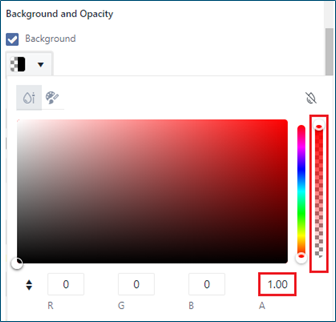
Background Color
Apply a background color to the symbol.
While setting the background color, take care to set even the background opacity (Opacity = 0 is equivalent to set a transparent backcolor).
The setting of the fill color is not still available in this version of SFHub Visualizer.
Opacity
Change the opacity (Visibility) of the symbol, the opacity can be set between 0 (invisible) and 1 (visible).
Border Size
Change the width of the border surrounding the symbol.
Border Color
Apply a color to the border of the symbol.
Border Style
Change the style of the border by choosing one of two options in the drop-down list, the choices being Solid or Dashed.
Arrange
Rearrange the symbols in a group, the four buttons are Front, Forward, Backward, back respectively.
Rotation
Rotate the symbol, the rotations start from 0° up to 270° with a step of 90°.
Connect to
Connect a symbol to another Element that is presented in the canvas, the connection can be made by selecting the Element from the list, or by clicking on the Select on tap button and clicking on the desired Element.
Please note of the checkboxes that are located next to both the background and border, they allow for enabling or disabling both styling Elements, by unchecking the box the applied background color or borders will be unapplied.
Prefab Style Tab
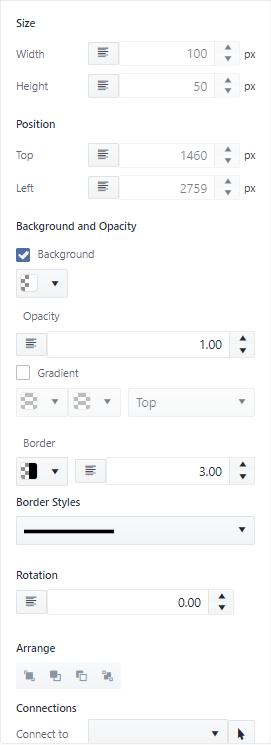
Size
Show the Height and Width of the symbol.
Position
Show the position of the symbol by modifying the distance from the top and left edges of the view box.
Background Color
Apply a background color to the symbol.
Setting the background color to prefab symbols like square, rectangle, ellipse, and circle is equivalent to set the fill color.
While setting the background color, take care to set even the background opacity (Opacity = 0 is equivalent to set a transparent backcolor).
Opacity
Change the opacity (Visibility) of the symbol, the opacity can be set between 0 (invisible) and 1 (visible).
Gradient
Change or set the gradient of the symbol (starting color, ending color and direction).
Border Size
Change the width of the border surrounding the symbol.
Border Color
Apply a color to the border of the symbol.
Border Style
Change the style of the border by choosing one of two options in the drop-down list, the choices being Solid or Dashed.
Arrange
Rearrange the symbols in a group, the four buttons are Front, Forward, Backward, back respectively.
Rotation
Rotate the symbol, the rotations start from 0 up to 270° with a step of 90° 90�. Rotate the symbol, the rotations start from 0 up to 270 with a step of 90.
Connections
Connect a symbol to another Element that is presented in the canvas, the connection can be made by selecting the Element from the list, or by clicking on the Select on tab button and clicking on the desired Element.
The checkboxes that are located next to both the background and gradient to enable or disable both styling Elements, by unchecking the box the applied background color or gradient will be unapplied, and when checked, the other will be unchecked if previously checked and its style unapplied. (Ex: if background color is checked and red color is applied, when checking the gradient, the background is removed and unchecked.)
Polyline Style Tab
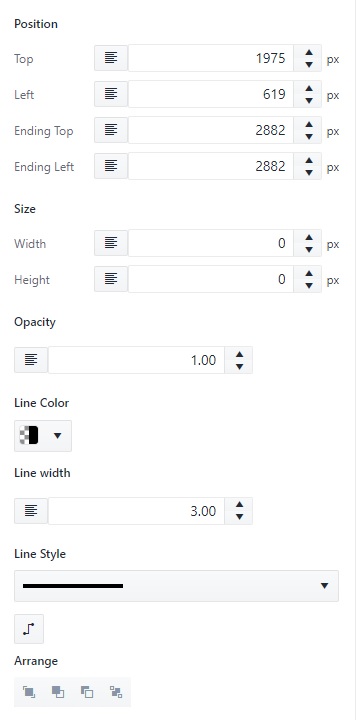
Size
Show the Height and Width of the polyline.
Position
Show the position of the polyline as distance from the top and left edges of the view box.
Opacity
Change the opacity (Visibility) of the polyline, the opacity can be set between 0 (invisible) and 1 (visible).
Line Width
Change the width of the polyline.
Line Color
Apply a color to the polyline.
Line Style
Change the style of the polyline by choosing one of two options in the drop-down list, the choices being Solid or Dashed.
Reroute
Reroute the selected polyline avoiding the overlapping with other symbols in the display.
Arrange
Rearrange the symbols or polylines in a group, the four buttons are Front, Forward, Backward, back respectively.
Text and Annotation Style Tab
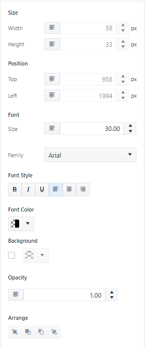
Size
Show the Height and Width of the text.
Position
Show the position of the text as distance from the top and left edges of the view box.
Font Size
Change the size of the text.
Font Family
Change the font family of the text.
Font Style
Apply styles to the text, the styles are (Bold � Italic � Underline � Align Left � Align Center � Align Right) respectively.
Font Color
Apply a font color to the text.
Background Color
Apply a background color to the text.
Opacity
Change the opacity (Visibility) of the text, the opacity can be set between 0 (invisible) and 1 (visible).
Arrange
Rearrange the text or annotations in a group, the four buttons are Front, Forward, Backward, back respectively.
The checkbox of the background property enables or disables the background property of the text, unchecking the box will result in the background color being removed.
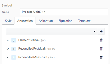
Annotation Tab
The Annotation tab allows you to add, configure or delete annotations. Annotations are static or dynamic texts associated with the Graphic Symbol or Graphic Template, giving it access to its properties and attributes.

To add an annotation:
- Choose an annotation type from the drop-down:
The drop-down makes available several options according to the nature of the Graphic Symbol:
- Graphic Symbol not referencing a Sigmafine Element (Not AF Element)
- Graphic Symbol referencing a Sigmafine Element (AF Element)
| Annotation Type | Not AF Element | AF Symbol |
|---|---|---|
| Free Text | Yes | Yes |
| Symbol name | Yes | Yes |
| Element name | N/A | Yes |
| Element description | N/A | Yes |
| Element attributes | N/A | Yes |
- Click the (+) button. The annotation is added to the annotation list below the drop-down.
- If the annotation holds a numeric value, you can select and assign a format used to print out the numeric value on the display (i.e. The proposed formats are the same supported by ProcessBook).
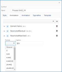
- The Caption field allows you to compose the string combining string literals with the dynamic annotation.
By default, the caption contains the @V placeholder representing the annotation value. You can optionally add further literals to format the value to be shown according to the following syntax:
[string literals] @V [@U] [string literals]
Applying a format - If defined it overrides the format selected from the drop down
[string literal] {@V:0.00} [string literal]
Applying a different unit of measure
[string literal] @V!(uom) [string literal]
Applying a different unit of measure and a format
[string literal] {@V!(uom):0.00} [string literal]
| Literal | Description |
|---|---|
| String literal | Optional fixed string to qualify the annotation. |
| @V | Annotation value. It will be replaced according to the annotation type: Name, Description, attribute values, etc. |
| @U | Optional placeholder you can use to print out the unit of measure. |
| {@V:0.00} | Apply format to the attribute value |
| @V!(uom) | Apply the uom to the attribute value |
| {@V!(uom):0.00} | Apply the uom and format to the attribute value |
Animation Tab
The animations tab applies simple animations to Elements available on the display. The tab contains the required fields to add, configure, and delete animations.
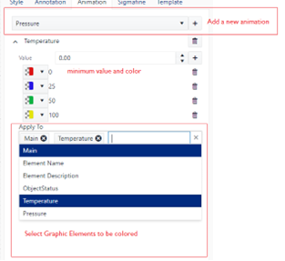
Follow these steps to configure the animation:
- Select the attribute, the source value.
- Configure one or more thresholds and their related colors. The threshold value is the lower value.
- Apply the animation to one or more graphic Elements.
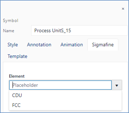
Sigmafine Tab
The Sigmafine tab allows to view or configure the Graphic Symbol reference to a Sigmafine Element. It has a dual purpose based on whether the graphic symbol has been assigned to a Sigmafine Element. The Tab is not available if the display is not bound to a Sigmafine Server.
If the Graphic Symbol is already assigned to a Sigmafine Element, then it shows the properties and the attributes of the referenced Sigmafine Element. This panel is like the Element Panel of the SFHub Visualizer application.
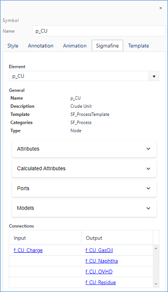
If the Graphic Symbol is not yet assigned to a Sigmafine Element, then it allows to select a Sigmafine Element to be assigned to the Graphic Symbol from the drop down containing the Elements of the corresponding Sigmafine Template.
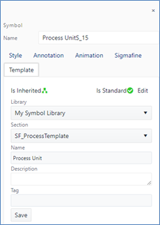
Template Tab
The Template tab is intended to show the information of the Graphic Template associated with the Graphic Symbol as well as for managing the Graphic Template configuration when creating and configuring a Graphic Template library.
Is Inherited Icon
This icon provides information whether the Graphic Symbol aspect is inherited from the Graphic Template.
If the Graphic Symbol icon is green then the Symbol is inherited from a Graphic Template
Graphic Symbols lose the inheritance when some specific properties are modified:
- Change annotation position.
- Edit of annotation caption or format.
- Add/Edit/Remove annotation.
- Add/Edit/Remove animation.
- Style changes to any Graphic Element.
The inheritance is not lost when the Graphic symbol is resized or rotated.
If the selection shows a blue outline, it means that the Graphic Symbol keep the inheritance with the Graphic Template.

If the selection shows a violet outline, it means that the Graphic Symbol has lost its inheritance with the Graphic Template. In the example below the Element name annotation has been moved from its original position, as defined in the graphic symbol template, to the top of the Graphic Symbol.

Is Standard Icon
This icon provides information whether the Graphic Template is a Standard Graphic Template or not. If the Graphic Template icon is green, then the Graphic Template is elected as Standard Graphic Template.
Edit
The Edit button selects the Graphic Template as Standard Graphic Template for the library section.
Following dialog gives two options:
Standard Graphic Template: Select this option to indicate that it will be your own (user preferred) default Standard Graphic Template.
Global Graphic Template: Select this option to indicate that it will be the default Global Standard Graphic Template for each user using that symbol library.
In both the cases, the Graphic Template will be the default one that will be used when an Element is added to the display from the Elements Panel or Template Panel.
Only one Graphic Template can be set as Standard or Default Graphic Template in each library section.
Library Information
This section allows to see the Graphic Template from which the Graphic Symbol has taken its graphical aspect.
When creating or modifying a Graphic Template, this section allows to select:
- The Graphic Template library (Library drop-down) and
- The Section (Section drop-down)
The new or modified Graphic Template is saved with information such as:
- Name (mandatory)
- Description (optional)
- Tag (optional)
The Tag is mandatory when configuring a Whiteboard library since it is used to set-up the mapping between the Graphic Template and the Sigmafine Element template during the convert to Model procedure of a Whiteboard display (see CONVERT DISPLAY TO MODEL).
Add New
This button is shown when creating a new Graphic Template, or changing the destination library or library section of an existing Graphic Template and it allows you to add the Graphic Template in the selected Graphic Template library and section.
Save
This button is shown after changing the aspect of an existing Graphic Template and it allows you to save and replace the Graphic Template in the Graphic Template library.
Save As
This button is shown after changing only the name of an existing Graphic Template and it allows to create a new instance of the Graphic Template in the Graphic Template library section.