Chart
The Chart panel allows you to enable/disable some features of the Chart visual object. The Chart Properties panel is divided into three sections; Chart Theme, Chart Type and Chart Settings.
Chart Theme
Chart Theme allows you to choose the color theme to be applied to the whole chart.

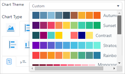
Chart Type
Chart Type allows you to choose the kind of chart (Type) to visually present your data.


After the chart type is chosen, you can choose between from the supported styles.


The above example displays the following Bar Chart styles:
 Bar
Bar  Column
  Column Stacked
  Bar Stacked
Chart Settings
Chart Settings opens a toolbar that allows you to configure the settings of the selected chart type.

The details of the Chart settings are illustrated in a separated section since the behavior of each setting may be different according to the selected chart. See Chart.